Signs that Work
People don’t tend to think about new signs working until something about their new sign fails to work.
Everyone wants their new sign to be attractive. But a sign needs to perform its primary goal well; with the sign becoming ever more beneficial to you the more goals it is equipped to deliver.
Signs do not all work automatically, as our pop-up examples demonstrate.
Risk of non-working signs is reduced by establishing goals — and then taking steps to ensure those goals are met.
Learn what working signs consist of and learn ways to ensure that signs work.
7 Goals for Signs that Work
1 — Visible, Legible, Understood
Your sign works when it can be seen and read
The primary goal of a sign is communication.
Clear graphics are only one part of the equation.
The other part concerns proactive measures to counteract detriments that will obscure your message or conceal your sign where it is situated.
- Full time visibility is preferred, not part time.
- Visible and legible from any and all practical angles of approach.
- Legible with attentions paid to proximity near and far.
It’s true. A sign can have it all, except visibility and legibility.
It comes as a surprise that a sign can be professionally fabricated and installed; done in quality materials; designed to last, and yet it is unintentionally hard to find and read. Here are pop-up examples.
- Camouflage effect
- Chameleon effect
- Murky effect
- Part-time legibility #1
- Part-time legibility #2
- Overwhelmingly ambitious
- Directionally dependent legibility
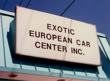
Camouflage effect
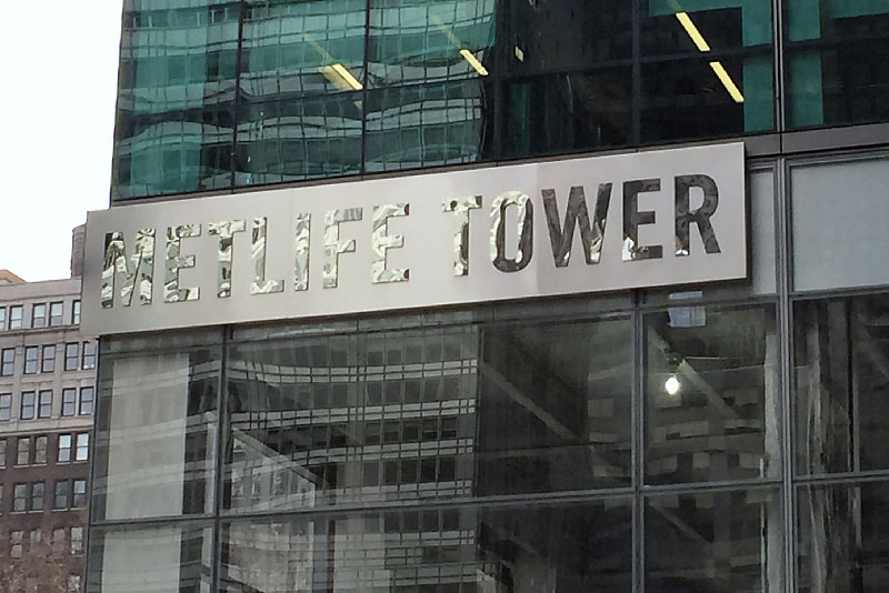
It’s a fair statement to say that the major tenant who has earned building identification rights did not expressly request their message be camouflaged.
This sign represents a large capital expenditure with low bang for the buck.
“Brightly polished metal acts like a mirror: It reflects whatever is around it.”— Light, Science and Magic: An introduction to Photographic Lighting, by Fil Hunter & Paul Fuqua.
From that we might postulate, “a polished finish is taboo for lettering intended to be read. Polished finishes are okay for decorative elements.”
A specification tweak that would have made this sign work is swapping the letter and background finishes. Better, just eliminate polished altogether. Because no matter from which direction you approach the sign, it’s a complicated environment that gets reflected in random and unpredictable ways.
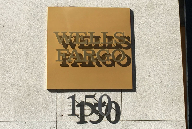
Chameleon effect
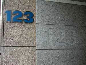
Upon close inspection, you can spot the building address number that was originally included at the building’s unveiling. It’s since been accompanied by a conspicuous version.
Make no mistake. Subtlety is good. In the right circumstance.
A building address isn’t one of them.
Tone-on-tone solutions often furnish an effect similar to a chameleon. It’s as though the characters took on the appearance of the background it occupies.
Un-pictured is a variant of chameleon effect that is more akin to a chameleon. Because the sign starts out with a finish unlike the background that supports it. It occurs when a polished finish sign is positioned on a wall of a given tone that is opposite a wall of the same tone. It’s not only chameleon-like, it’s also strikingly similar in appearance to the outer space creature using advanced cloaking technology in the old action hit, Predator.
The specification tweak for sign types that must be seen and read is, "just say no to tone-on-tone."
Murky effect
This is way too costly a sign to have the communication sucked out of it by surrounding circumstances.
Satin-finished stainless steel can look the bomb, unless it’s the wrong kind of bomb, stemming from surroundings that fail to enrich it.
The reflective nature of all satin-finished metals are highly sensitive to light (or lack of it).
What’s believed to have occurred is a dark metal ceiling reflected in the sign — a sign that is further knee-capped by being tone-on-tone metal. There isn't one iota of in-built contrast that might have helped the entirety to be easily read.
We don’t doubt that the design drawing depicting the sign made it look amazing before the actual sign materialized on site.
The specification tweak that could have helped (assuming inability to directly illuminate the sign) is switching to painted metals that could have approximated the design direction while supporting the ability to be seen and read.
Part-time legibility #1
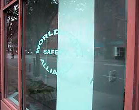
This sign actually featured 2 states. Partially seen, or unseen. Partially seen as in the photo. And unseen, when the owner drew their white vertical blinds closed.
White vinyl appliqué letters are wonderful for store windows. Because white lettering contrasts so well with windows appearing dark much of the daytime. Take a look at stores across your street. You’ll start noticing this phenomenon of darkness in store windows.
Trouble occurs when your store interior sports a large white element near the window. The sign winds up legible part of the time, depending upon where you’re standing in proximity to it.
The specification tweak that would have made all the difference is addition of a dark outline on all the lettering. The sign would have been fully visible regardless the white column. And same, if and when their white vertical blinds were drawn closed.
Part time legibility #2
Legibility of exterior mounted signs can be adversely affected by shadow cast by the sun.
We see a fair share of exterior signs with part-time legibility imposed by the sun.
There are parts of the day when shadows are nil, but those parts of day happen to be when foot and street traffic is low. All someone can hope for are cloudy days allowing the sign to be easily read all day.
Whenever we’ve seen artists depict floating letters in a rendering, it’s never drawn to appear sticking way out there.
The depicted letters are mounted on conspicuously long pins. Some feel pins are ideally used at short length and only on letters that effectively conceal the pins, creating a mysterious and subtle floating effect.
You don’t need to project all that much to achieve depth in this kind of sunlight. Witness the amount of shadow created by the background plaque.
The specification tweak to bolster full-time legibility in this case would have been to lose the pins.
Overwhelmingly ambitious
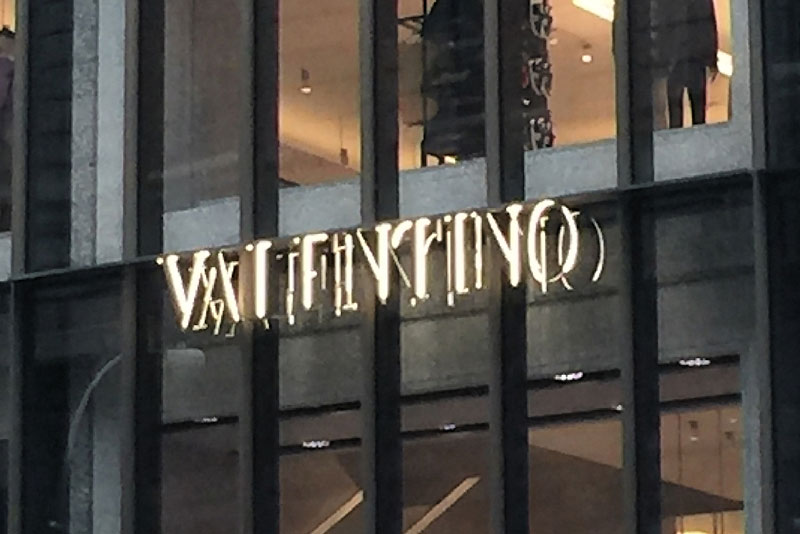
A person could decipher what this sign reads by external clues: familiarity with fashion brands, seeing products in the window, and seeing the kinds of stores within its immediate vicinity.
This a mighty effort that happened to have turned out counterproductive.
Getting illuminated letters up there with no apparent attachment or background took a lot of planning.
This sign can only have been green-lit to furnish if the rendering of it appeared clearly legible.
If your store brand is not internationally known and you bought a similar sign, you might be unlikely to have any attention paid to deciphering what your sign reads. It will just go ignored.
The specification tweak in this case would haven been to apply matte black vinyl to the glass right behind the sign, so that it prevents rearward light reflections from complicating matters. Black vinyl is not the penalty one might think, because the glass is dark to begin with; it appears to be in front of a support beam at that spot, and the resulting strong, legible message is what will be immediately apparent.
Directionally dependent legibility
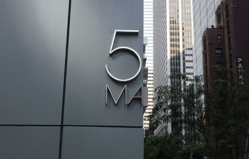
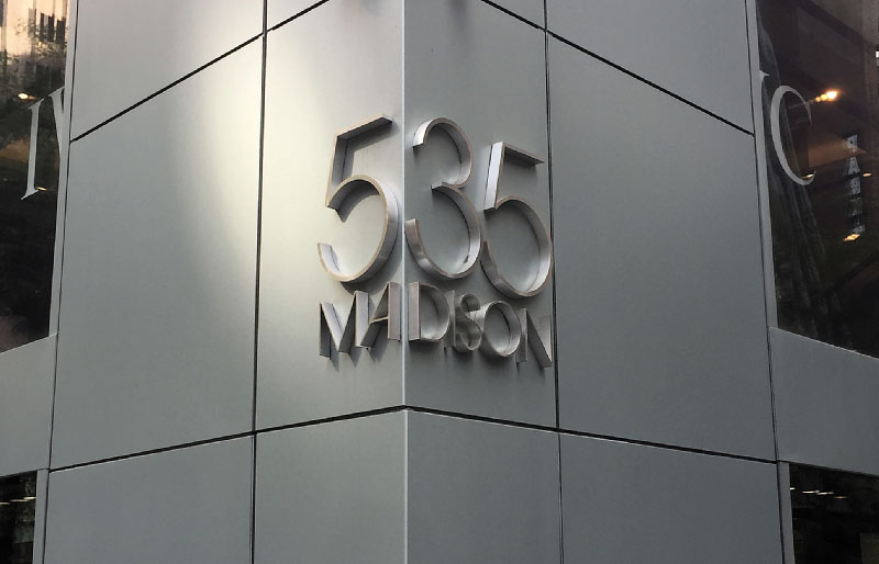
Coming up the block, all that initially registered was the “5 MA.” “35 DISON” is all you see coming from the adjacent direction.
We love creative ideas, along with a client who is daring enough to let you go ahead with it. Some creative ideas come with a price to pay. In this case, it’s directionally-dependent legibility.
This is the first time we’ve seen this kind of limitation.
There could have been a financial incentive. The building only needed one sign instead of two. But more than likely, the incentive was an expression of wit.
The case is made for demonstration purposes. No specification tweak. They knew exactly what they were doing and they got their anticipated result.
2 — Consistent with your brand and profession.
Your sign works when its appearance supports your brand and your profession.
Layout and materials dress your message and reinforce your market position.
Make it apt, engaging and reassuring.
An unsupportive sign can go beyond doing little for you. It can actually work against you.
Example of an unsupportive sign.
Unconvincing effect
Here is a sign that is clear in what it reads, but there are those that may not be buying what it says. Figuratively and literally.
Good design helps you appear credible. Absence of design helps you appear incredible. (In a bad way).
In our opinion, the confidence this sign inspires is the possibility that they’ll have folded and moved on when you return to pick up the car you’ve placed a deposit on.
Specification tweak: You can save a buck and use the same shape and method. Just replace the sign panel with one bearing relevent typography and a strong layout. Hire a graphic designer with the chops to do a number on it. Your ideal customer will register a positive impression correlating your product with your sign.
3 — Tailored to fit
Your sign works when it occupies the right amount of space
Your sign should not only suit you; it should fit right in.
This topic predominately applies to signage systems, where a sense of uniformity is preferred. Inspect spots where signs should go while keeping messages in mind. Establish a happy medium.
- Uniform backgrounds fit all spots and all messages fit on the uniform backgrounds.
- Uncover whether there’s in fact a spot for every sign to be.
- Uncover random interference from previously installed security or fire safety apparatus.
4 — Coordinate with your surroundings
Your sign works when it looks like it belongs
Your signs can appear to accessorize your facility, not unlike how accessories help make an outfit.
- Signs can be styled to coordinate, or contrast, with the prevailing interior decoration.
- Signs can adopt elements seen in the facility, such as colors, shapes, branding, trim, borders.
- Fonts can be selected in a corresponding style.
- The conspicuousness of signs can be controlled.
5 — Planned for feasibility
Your sign works when its content is furnished in compatible specifications
The feasibility test involve these inquiries: Can it be successfully made? Can it be handled during the course of manufacturing? Can it survive transport and be able to be securely installed? If so, it’s compatible.
Client’s graphics vary considerably in design characteristics and sizes. Materials have limitations, as do sign-making techniques, as do installation substrates. A feasible project considers all variables, leading to a specification compromise that is your curated short list from which to choose.
Feasible planning also backs into arriving at an in-built means of secure attachment.
Feasibility intertwines with durability, so there is some overlap with the next section.
Dropping the ball on feasibility inevitably leads to consequences.
Non-Feasible Installation


6 duplicate signs arrived from out of town.
They proved un-installable. They were last seen here; occupying space in a storage room.
This could be the ultimate non-working sign.
6 signs to be precise. All brand new, yet scrapped because no one was able to install them.
Our hunch? This became non-feasible by a sign shop dutifully and unquestioningly following somebody’s specifications. The sign shop ought to have known better and it should have intervened.
This was a specification problem and we solved it. We furnished exact duplicates of these solid stainless steel behemoths, except in lighter weight aluminum and with an in-built means of secure attachment.
As to the backstory, the scrapped signs were purchased somewhere by our client’s home office, who had also contracted with a local New York sign company to receive and install them.
The local sign company tried, then threw in the towel, upon which our client contacted us to come and see what we could do. As it turned out, we couldn’t install the original 6 signs either.
6 — Planned for durability
Your sign works when it goes the distance
Each sign should be suitably equipped to help counter conditions to which it will be exposed.
Planning for secure fixings: Material and means should be checked against commercially available fixings and vetted installation surfaces.
Think of it as appropriate attachment interfaces, each modified for your facilities diverse substrates and surface decorations, presenting the maximum strength attainable under each unique combination.
Proximity to the public: Signs located among passersby are subject to touching, fiddling with, or tampering. Going with a less susceptible manufacturing method or material helps forestall damage, whether intentional or not.
Proximity to outdoors and weather conditions: Properly dress your message for the weather. Anticipate environmental exposures, fluctuating temperatures, wet, dry or windy conditions; the effects of bright sun and the darkness of night.
The appropriate means of dressing your message help stem deterioration and maintain communication.
Here are examples of unfortunate results that a minor tweak or two could have avoided.
Expressly planning for durability. You pick the material / sign making methods for the look you’re after, while considering what the sign might undergo where it will be situated. Modify to counteract.
Wherever it’s intended to be permanent, the non-durable becomes a nuisance and an extra expense. Sometimes you’re throwing good money after bad — continually propping up a poorly planned result.
If a sign depicts your name or logo and it’s rapidly deteriorating, the non-tangible aspect of non-durable expense becomes incalculable. (unless, of course, deterioration supports your brand, rather than sullies it.)
Unplanned fixing
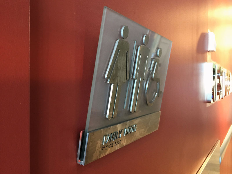
Shocking to see this condition of restroom signs on Liberty Island, the site of America's Statue of Liberty in New York.
Designing signs for an internationally-known monument must come with it the impetus to do something impressive. For some, it’s expressed in real glass and real stainless steel.
But if that’s the direction, isn’t it incumbent at the design stage to specify an attachment method that will work? Answer: Yes.
A fixing that is unplanned leaves a sign ill-equipped to be among the public at large. Especially a public at perpetual high-capacity in a portion of the venue that is as well-traveled as any born of human necessity.
Can you envision the weight of the glass and solid stainless steel bearing down on a single row of screws or studs? Because that’s what appears to be happening here. Not so bad if the walls were in granite or marble. But in this case, the hardware is penetrating drywall, with a makeup that can crumble around hardware when some lateral stress is placed upon it.
Specification tweak: At the very least, stagger the hardware. Go one better, make sure that solid wood blocking has been concealed in the spot where the restroom signs go.
Unequipped for proximity to the Public
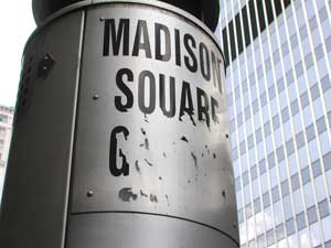
So what happened here? Was it Freddy Krueger meets Logan at the base of this column?
There’s been instances of vinyl adhesive failing to stick to surfaces, but that’s not what appears to have happened here.
In cases where signs are subject to touching and fiddling with, consider using a more permanent means of making the sign. Even if it costs a little bit more to do.
Although the solution in this case would have cost a lot more if done at the time this photo was taken. This photo was shot before the advent of digital printing.
Yet, digital printing is not a panacea, because it, too, can be harmed, besides the fact that digital printings external “shelf life” isn’t all that long. So a replacement would be necessary at some point.
The cool, but costly, means would have been to acid-etch the lettering into metal and then have it mechanically rolled to the column’s contour.
Proximity to weather conditions
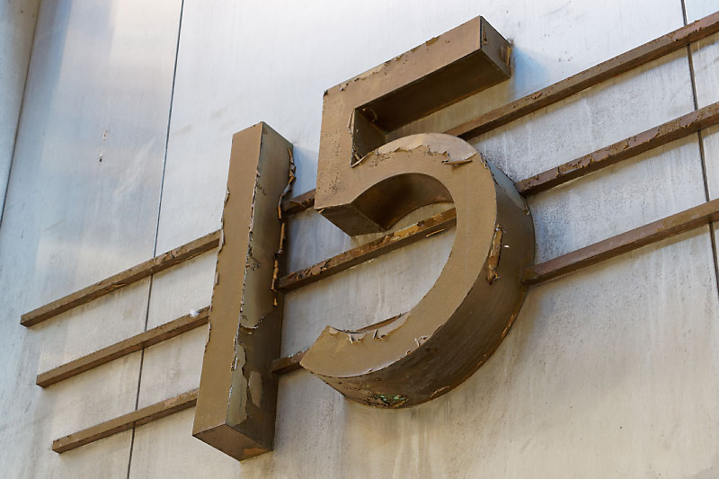
Exterior positioned signs that are meant to be there forever are candidates for upping the ante in solutions meant to survive.
Heavily deteriorated signs are useful in one case: depicting urban wasteland in post-apocalyptic movies.
Your facilities’ signs needn’t be depicted as such (unless it’s lucky enough to be spotted in the local theater).
Donning the archaeologist’s hat, there’s an appearance of rust in the ruled lines interpreted in extruded metal, which could be steel bar. Extruded aluminum bar is a superior alternative. The peeling paint almost appears as though it was a coating added to refresh already deteriorating paint.
The specification tweak in this case includes using aluminum as the base material, in both sheet and bar. Then using a 2-part acrylic polyurethane paint coating over zinc chromate primer.
The result will be a colorfast coating that’s aircraft quality, with exceptional UV resistance and scratch resistance.
7 — In accord with local and federal law
Your sign works when it conforms to prevailing rules and laws
Observe fire safety codes and codes related to The Americans with Disabilities Act (ADA).

Achieving working signs is proactive
Working signs evolve, in part, by reconciling materials and means with existing conditions.
- Source materials ( logos, messages, etc)
- Physical materials and finishes comprising signs, and
- Specific conditions where signs will be situated.
Experience holds that if you cannot control the source material, nor the conditions at the destination, then your focus is on the specifications.
In a way, your curated specs can be considered defensive in nature, in that you are consciously mitigating a potential problem by making a change.
It could wind up that the best possible solution is the one presenting the least amount of problems. Because conditions / situations / timelines; perhaps even the client themselves, can unintentionally interfere with the outcome.
Above all, if you wait too long to address signs, you’ll inevitably lack the time, the ability, or the wherewithal to see to it that signs will work.